10 examples of a good 404 error page

We have all come across the 404 error page. But what are they for? They are landing pages that appear when the server can't find the link entered or selected by a visitor. This error causes the visitor to not land on any page of the website. It is very practical, but it doesn't have to be boring! Many businesses turn this error page into a creative opportunity to entertain and engage their clients.
WHAT MAKES A GOOD 404 PAGE?
What makes a 404 error page a success? First and foremost, it must inform visitors that they have lost their way, while showing empathy. It must also meet the following objective: keep the visitor on your website. A well-designed 404 page can be a valuable tool for keeping visitors interested.
Some companies create interactive and engaging pages with well thought-out code, while others simply present a redirect link to the home page or blog. The key: Create a design that reflects your brand identity and tone, while effectively redirecting visitors to the best possible content.
10 EXAMPLES OF GOOD 404 ERROR PAGES
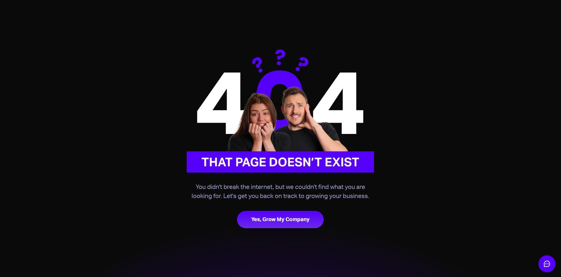
Beyond marketing agency
Beyond marketing agency is a company that helps businesses grow their online presence. It uses humour to remind us of its mission on their 404 error page, among other things thanks to the call-to-action button. It clearly tells the user what they will get by doing business with Beyond. This mix of humor and practicality reinforces the visitor's commitment to the brand.
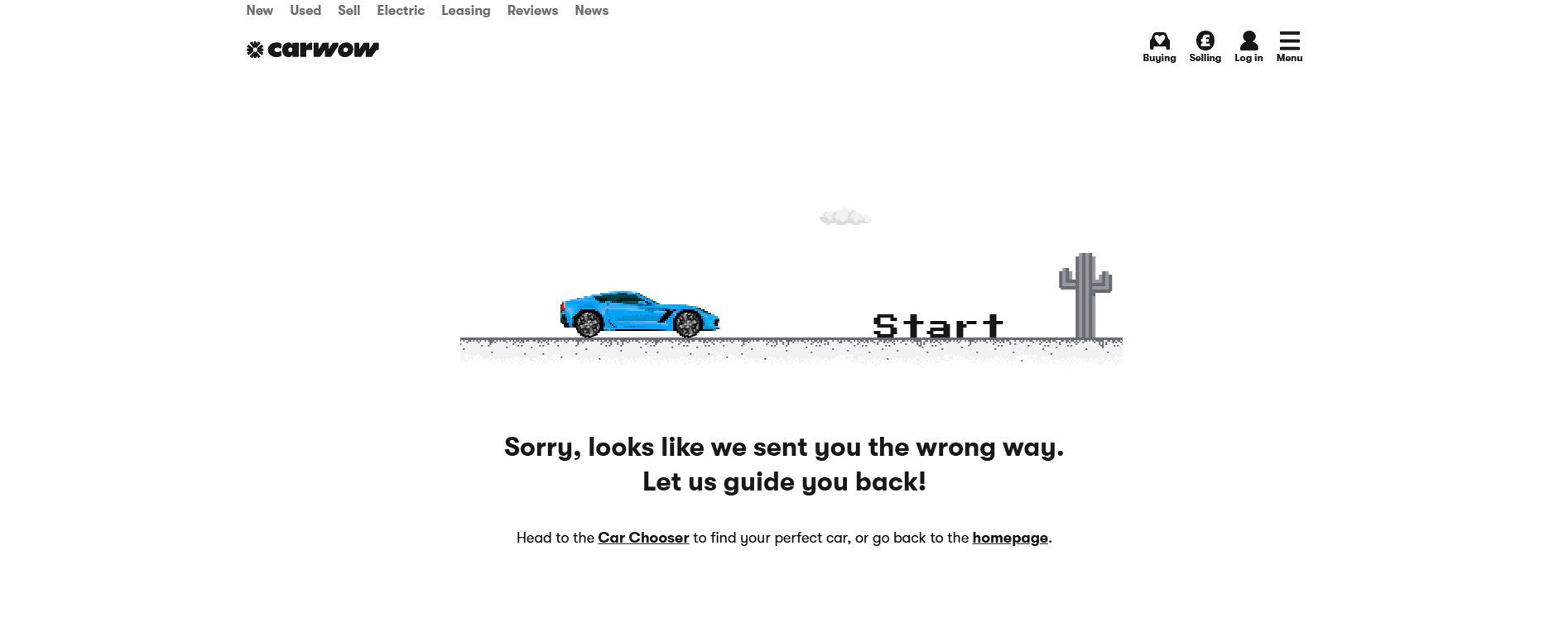
Carwow
The British company Carwow opted for a dynamic 404 page, reflecting its values and products. On arrival, visitors are entertained by an interactive game or redirected to a page that better corresponds to their initial search. Both are not trivial: they capture attention, increase time spent on the site, and promote a positive user experience.
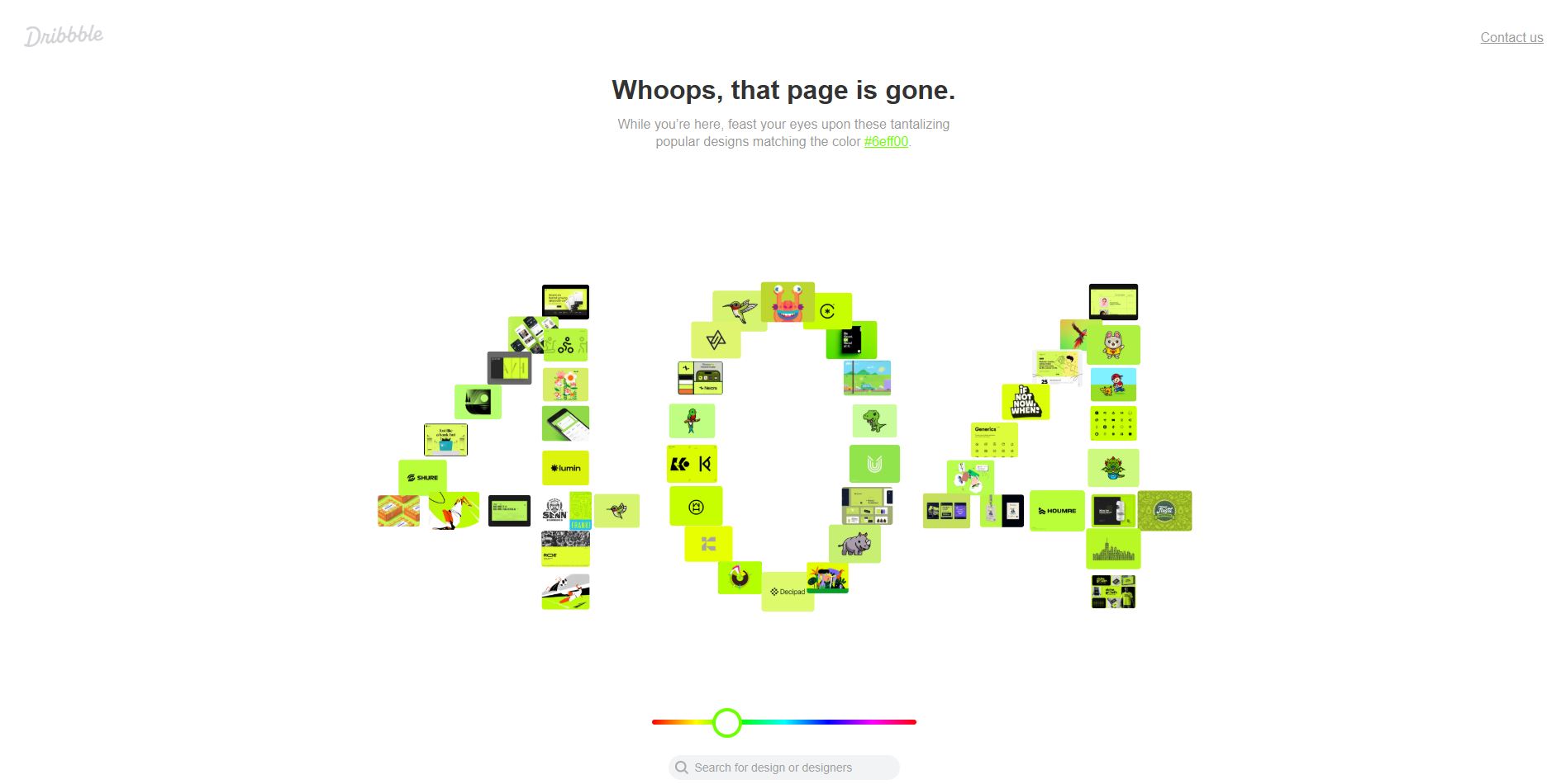
Dribbble
Dribbble is a platform used by web designers to showcase their creations. The platform highlights designers’ work on their 404 page. This allows visitors to discover interfaces according to the color of their choice. The interactivity of the page captures attention, while offering users the opportunity to find a design that they like, thanks to both the color search and the search engine available at the bottom of the screen.
IMDb
IMDb stands out with an error page that will appeal to moviegoers: it displays a movie quote, different each time the page is updated, accompanied by a link to the corresponding page. In addition to this, the page clearly says that the URL is wrong and offers a web address to return to the home page, facilitating navigation.

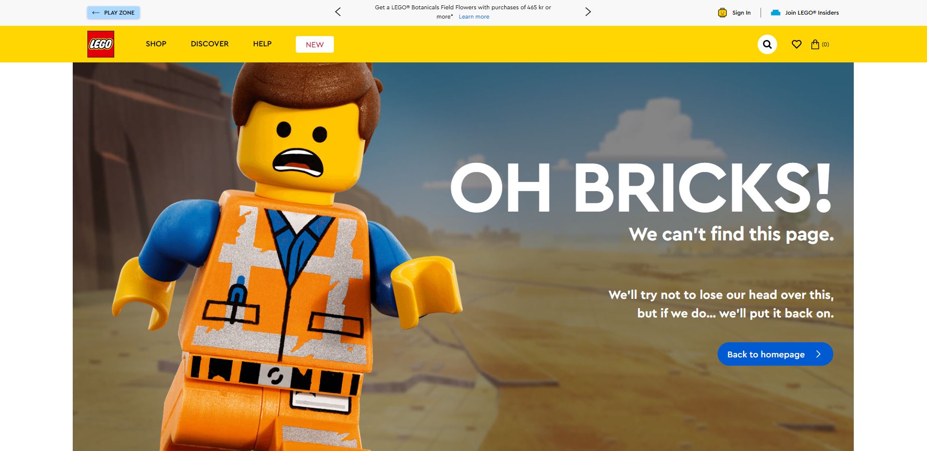
Lego
Lego uses humor to indicate that the page visitors are looking for does not exist. The title clearly explains the situation, while the text and image fit perfectly with the playful brand identity. A well-positioned button redirects users to the homepage to continue their navigation. All of these components contribute to making this 404 page a model of efficiency and coherence.
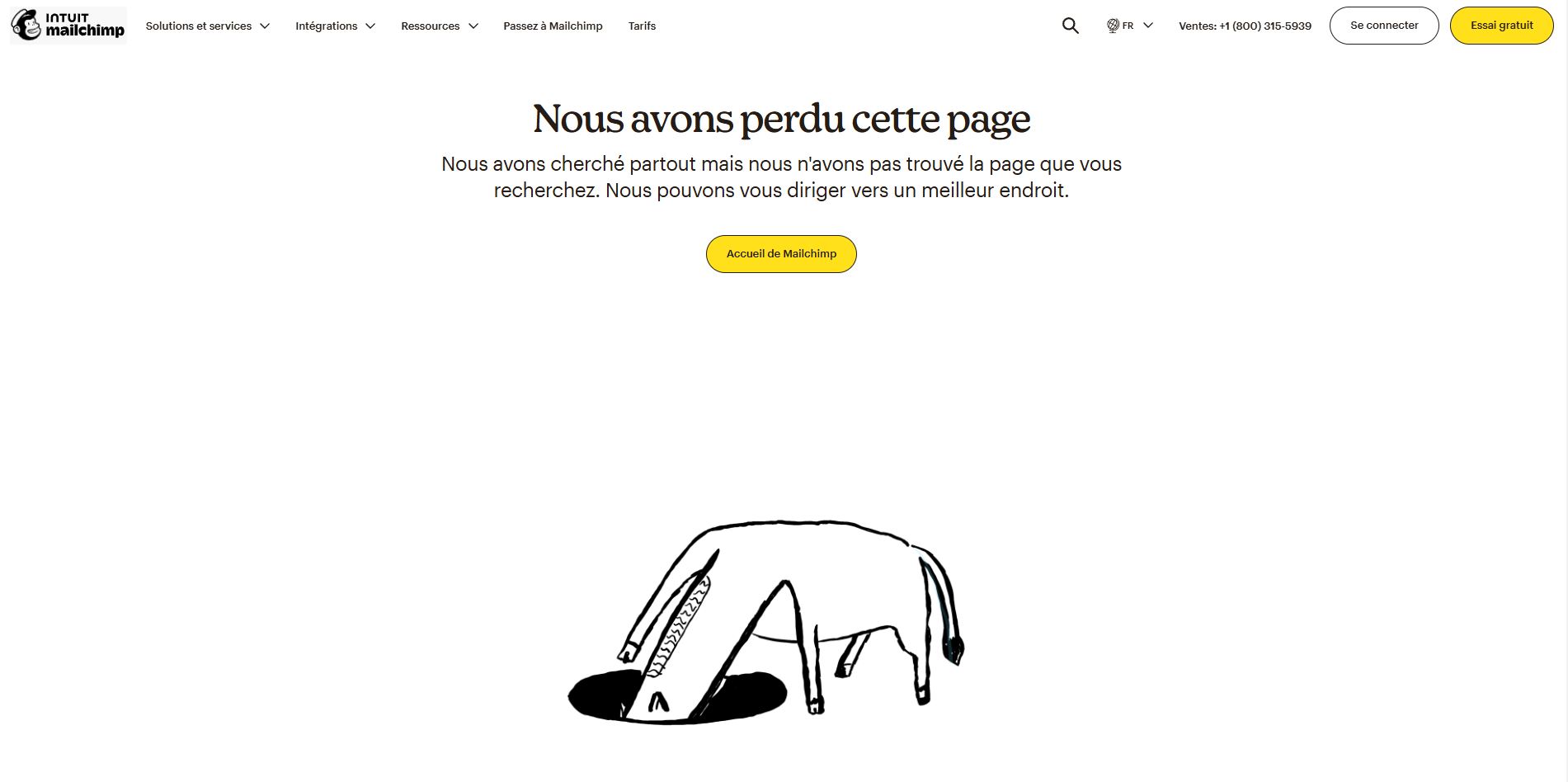
MailChimp
Mailchimp’s 404 page (a platform specializing in sending newsletters) fits well with the company's brand image. The professional tone quickly tells users that the page they are looking for does not exist, and a button prompts them to return to the home page. There is a humorous touch in both the text and in the illustration, reinforcing Mailchimp's unique voice that can be found on the rest of the site and in its other communication tools.
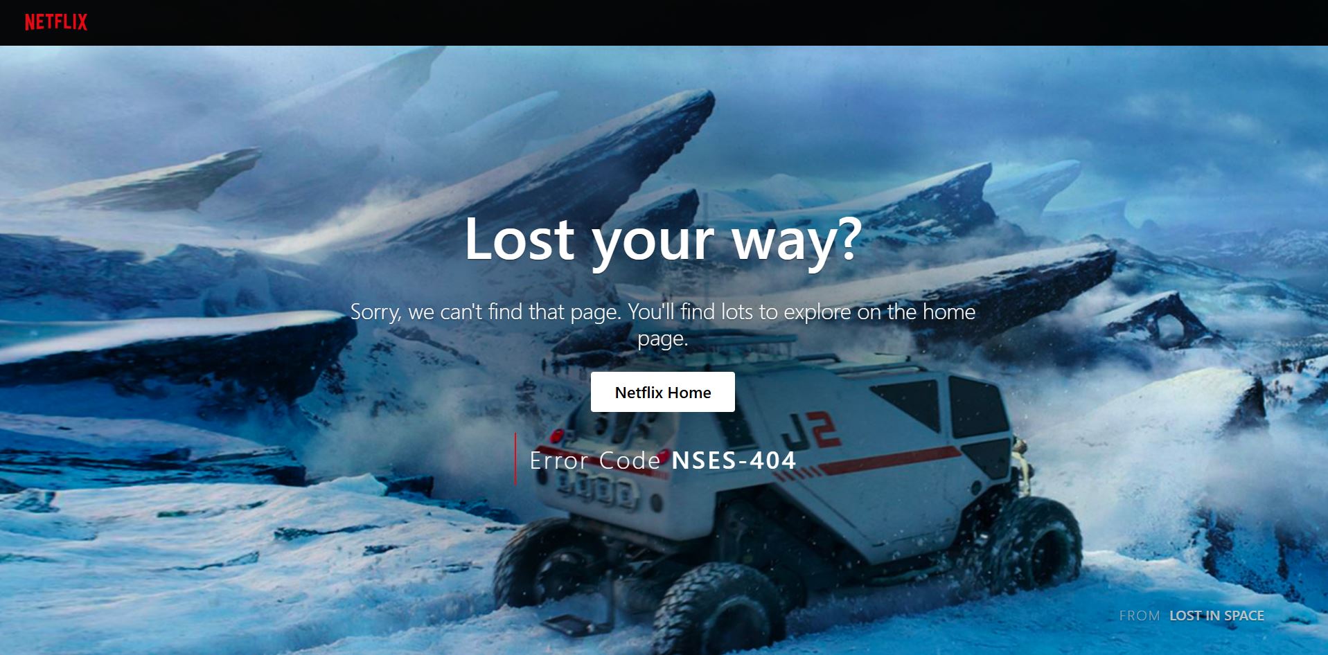
Netflix
Netflix gives a nice nod to Lost in Space by using a photo from the movie on its 404 page. The title makes it clear to users that they are in the wrong place. The button, which contrasts nicely with the background, redirects the person to the reception desk, where they can find more of what they are looking for.
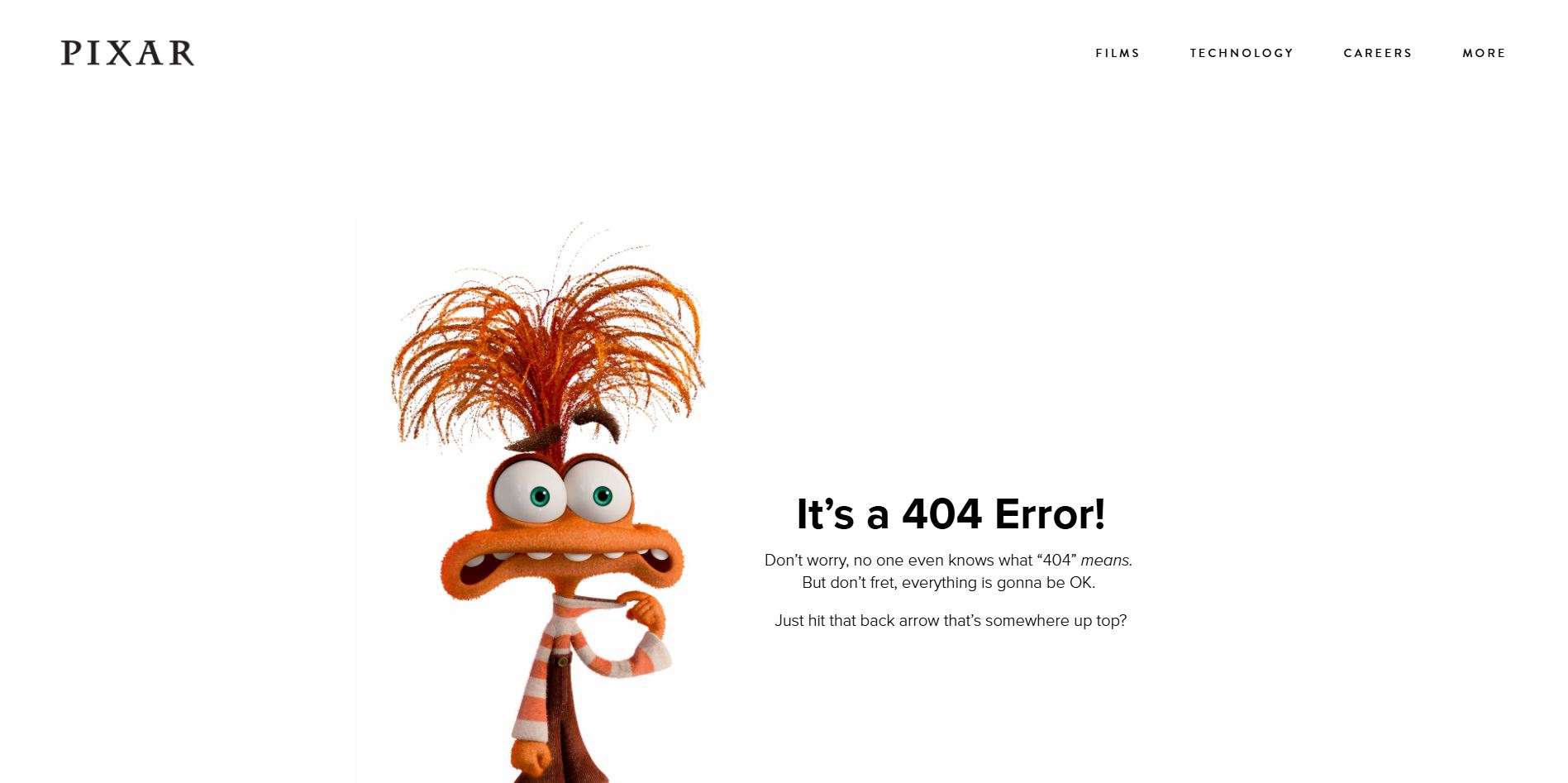
Pixar
Simple and effective, that's what characterizes Pixar's 404 page. The addition of an emblematic character from a company film adds a nice creative touch while placing the user in a familiar universe. With a touch of humor, the brand gently guides the user to the sections of the site that can provide them with the information they are looking for, while remaining true to its warm and imaginative identity.
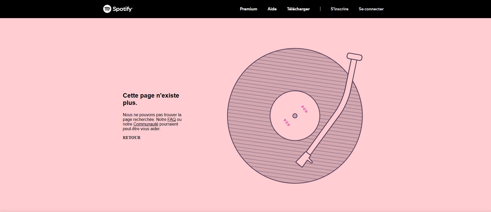
Spotify
In the case of Spotify, a simple animation on the 404 page grabs attention without distracting from the reading text. The track, a reference to Kanye West's album 808 & Heartbreak, fits perfectly with the brand's youthful tone. This error page stands out for its practicality. It offers several options to guide users, for example, the possibility to consult the frequently asked questions, visit the Community page for help, or return to the previous page.
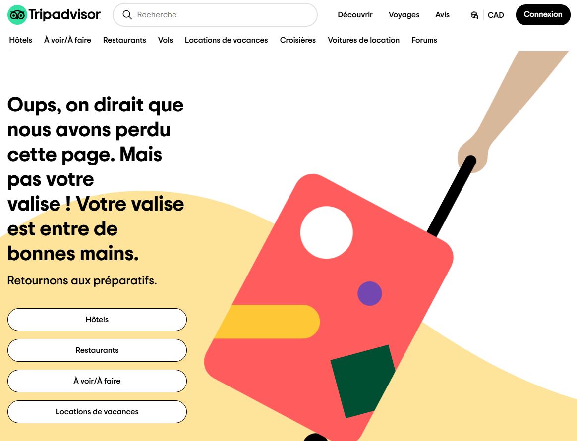
Tripadvisor
TripAdvisor's error page varies from time to time, which adds a touch of originality and avoids monotony for users encountering this problem repeatedly. In this version, the company makes a funny analogy between coming across a wrong URL and losing a suitcase, thus minimizing the visitors’ annoyance. The buttons, which are clearly visible, also allow users to access the section of the website that will best meet their needs.
Your 404 page is a unique chance to show off your creativity while providing an enjoyable experience for your visitors. Use this error page to stand out! Get inspired by these examples to design an original and effective 404 page today with WebSelf.

Roxane has always written and dreamed of making a living from her pen. Now a web editor, proofreader and author, we can say that it's mission accomplished!