Left-aligned, centered, or justified: which one should you choose for your website?
Have you written quality content for your website, but your visitors barely read it? The problem may be with your text alignment. This seemingly innocuous design choice directly influences readability and your professional credibility.
However, we have good news for you! Follow these few simple rules to choose the best alignment every time. Find out what alignment to adopt based on your content, why some choices work better than others, and how to avoid common mistakes.
WHY TEXT ALIGNMENT IS WORTH YOUR ATTENTION
Text alignment (left, right, center) directly impacts the appearance of your website and the impression your visitors get from it. However, its effect goes far beyond aesthetics. Choosing the right alignment also means:
making your content more readable
improving user experience and accessibility
strengthening your credibility and professionalism
enabling users to find what they are looking for faster
ensuring optimal readability on all devices: mobile, tablet, computer
maintaining visual consistency from page to page
helping create a clear visual hierarchy
To take full advantage of these benefits, keep the same formatting for all your headings and paragraphs on each page. This uniformity creates constant visual cues that make navigation easier and the user experience more enjoyable.
Now that we've covered these basics, let's look at the question you're really interested in. What's the best alignment for my texts?
LEFT ALIGNMENT: THE ONE YOU SHOULD USE MOST OFTEN
If you're not sure which alignment to choose for your text, go with the one on the left! Each text line will end unevenly, but they will all start at the same place. Result? Reading becomes faster and smoother, as the eye can easily spot the beginning of each line.
Left alignment also improves readability by creating uniform spacing between each character and between each word. The constant spacing allows the eye to move naturally from one word to the next without interruption or slowing down.
Note: this principle only applies to languages with a left-to-right reading direction, such as French and English. For an Arabic website, for example, you can right align your text in order to reproduce the same effect.
WHEN TO USE LEFT-ALIGNMENT?
Left-aligned text works everywhere. However, here are the places where it's especially essential:
In your multi-line written content: Most of your text, such as product descriptions, informative paragraphs, and blog posts, should be left-aligned.
In bulleted lists: One of the great uses of bulleted lists is to present information in a structured way, thus simplifying reading. It is therefore important that all the bullets are aligned with each other for maximum effect.
In forms: align field labels ("Name," "Email," etc.) to the left so your website visitors can instantly spot them without having to scan the entire width of the screen.
CENTERED ALIGNMENT: FOR SHORT TITLES ONLY
Centered alignment should be used sparingly on your website, as it forces readers to look for the beginning of each line. This slows down the reading and requires more effort from the reader. So, avoid centering long paragraphs of text, as this will cause a lot of cognitive fatigue in your visitors. Finding answers to their questions will be more difficult, and they may leave your website to continue their search elsewhere.
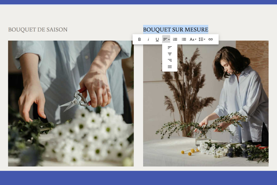
That's why it's best to center only your very short text, such as titles and subtitles. This alignment can also be used if you want to highlight a piece of information or a quote of two lines or less. Be careful not to overdo it, though. If you center too many elements, they all lose their impact and blend into the crowd instead of sticking out.
For example, on an online clothing store's website, you could center the main title of your homepage ''New Winter Collection'' or the tagline under your banner "Find all your favorite pieces in one click". On the other hand, the product description text, return policy, and delivery information should all be left-aligned for easy reading.
AND THE JUSTIFIED ALIGNMENT IN ALL THIS?
It may seem tempting to justify the texts on your website. After all, it creates blocks with uniform margins, so it must have a positive impact on the reading, right?
Justification is very common in long printed documents, such as books, and is losing its relevance on digital platforms. It creates irregular spaces between words, which can become problematic for reading when they are very wide. Some platforms allow for hyphenation, and while it may seem convenient, this solution comes with its own challenges. Word cuts aren't always placed in the right places, and you don't have the option to choose where to put them.
This is the big difference with print, where you have control over the position of each letter. On the web, the location of these varies depending on the size of the screen, the zoom percentage and the browser. As a result, justified text that looks correct on your computer can become difficult to read on your web visitors' phones, with unsightly spacing that makes it difficult to understand.
QUICK QUESTIONS TO CHECK THAT YOUR ALIGNMENT IS OPTIMAL
Are my paragraphs longer than two lines aligned to the left?
Are my titles aligned in the same way on every page of my website?
Does my text display correctly on mobile devices, tablets, and computers?
How often have I centered short paragraphs?
Take a few minutes to browse your website with these questions in mind. Your answers may be a sign that changes may improve your visitors' experience. Sometimes, a simple change in alignment is enough to make your content clearer and more professional.
Text alignment may seem like a minor detail, but its effect on readability and user experience is considerable. By favoring left-aligned content and reserving centered content for short titles, you make it much easier for your visitors to read. Other ways to improve your site's UX and boost your professionalism include using a text color that contrasts well with the background and choosing typography that is easy to read on digital media. So, take a few minutes today to review the alignment of your content. Your website will thank you for it!

Roxane has always written and dreamed of making a living from her pen. Now a web editor, proofreader and author, we can say that it's mission accomplished!